Sesc SC
Portal responsivo projetado para o Sesc SC, sistema educacional profissionalizante.
Sesc SC
Portal responsivo projetado para o Sesc SC, sistema educacional profissionalizante.

Client
Sesc SC
Professional education system.
Year:
2023
Objective:
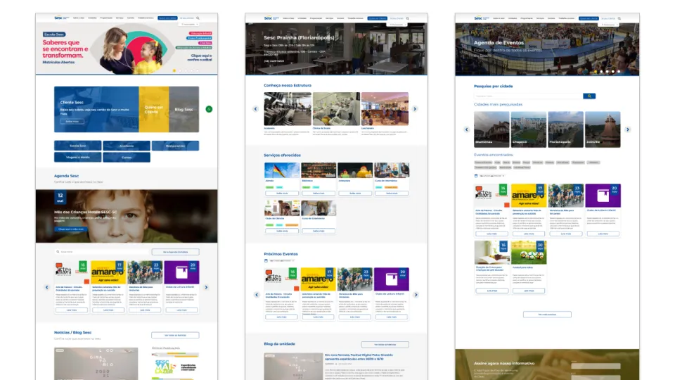
The UX project for the Sesc SC website aimed to redesign the portal with a focus on improving usability and user experience. The initial analysis revealed that the content featured varying formats and fonts, which compromised navigation, pattern recognition, and information organization.
To address these issues, the new portal was developed prioritizing content organization and hierarchy, as well as standardization of components, colors, and typography, following the guidelines of the new Sesc brand manual. These improvements ensured a more consistent layout, smoother navigation, and consequently, an enhanced experience for users.
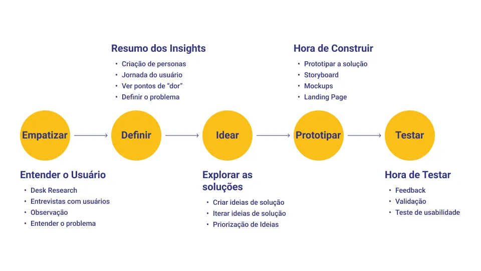
Work process
To redesign the Sesc SC portal, we followed a structured process focused on usability and user experience. We began with a detailed analysis of the existing site, identifying inconsistencies in formatting, navigation, and content organization.
Based on these insights, we developed a new structure that prioritized information hierarchy and standardized components, colors, and typography, ensuring alignment with the guidelines of the new Sesc brand manual. High-fidelity prototypes were created to validate usability before implementation, ensuring a more intuitive experience for users.
The development followed a mobile-first approach, optimizing the portal for various screen resolutions and guaranteeing smooth navigation on both mobile devices and desktops. The result is a more organized, accessible, and coherent portal that facilitates information search and significantly enhances the user experience.
Tools used
- Adobe Photoshop
- Adobe Illustrator
- Figma
- ChatGPT
- DALL-E
Deliverables
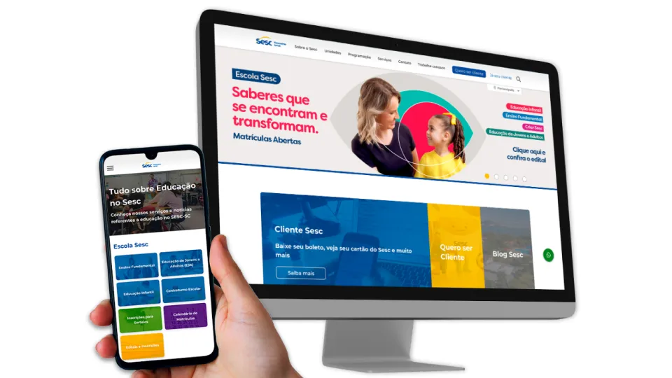
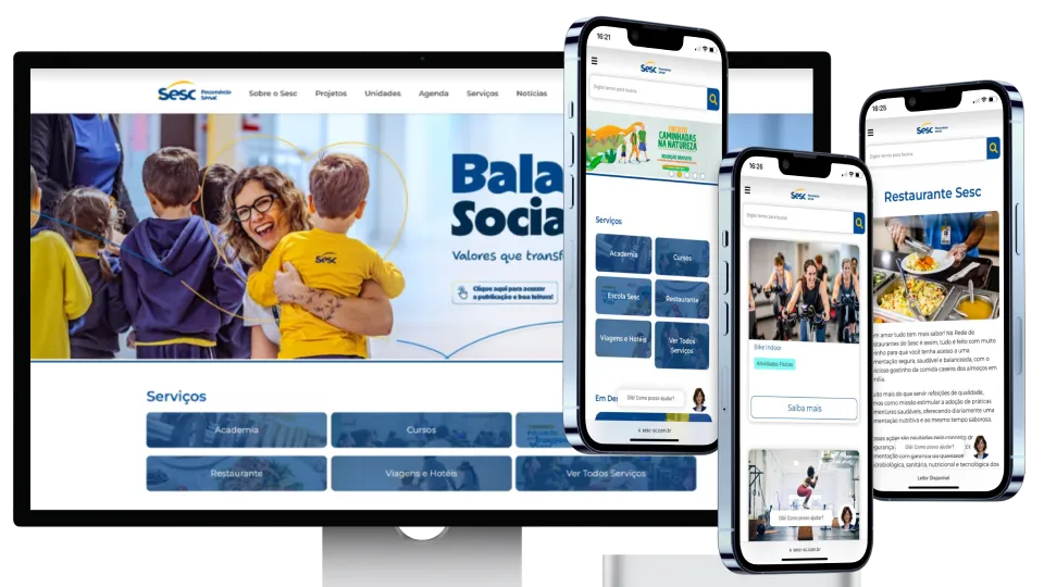
The project deliverables included not only the high-fidelity prototype but also the complete development of the new portal.
The entire site was designed and implemented following a mobile-first approach, ensuring that the content efficiently adapts to different screen sizes, prioritizing the most commonly used resolutions today: mobile (360x640) and full desktop (1920x1080). This approach provided a responsive and optimized experience both for users on mobile devices and for those accessing the portal on larger screens.
Results
With the redesign of the Sesc SC portal, we were able to resolve the issues identified in the initial analysis. Usability was significantly improved by eliminating inconsistencies in formatting and content sources, making navigation and the recognition of visual patterns easier.
The new structure prioritized the organization and hierarchy of information, as well as the standardization of components, ensuring a more consistent and intuitive layout. As a result, the portal now offers a smoother and more coherent browsing experience, aligned with the users’ needs.
Project link